Glass Box pattern: Visualizing enterprise AI black box
To secure strategic buy-in from Gartner by enabling trust for global enterprise leaders, I defined, designed, and delivered the "Glass Box Pattern." This is a design framework that translates complex, invisible AI orchestration into a synchronized visual narrative, proving system integrity during live demonstrations to turn executive skepticism into technical confidence.
- The Challenge: Bridged the trust gap for Gartner by transforming untraceable AI logic into a verifiable, human-centric narrative that proves system integrity.
- The Innovation: Created a synchronized split-screen framework for high-stakes executive demos that aligns real-time AI reasoning with user context to eliminate the ambiguity of autonomous backend actions.
- The Impact: Scaled the pattern from an initial executive showcase into the public launch of multiple AWS AI-related services and a reusable React Flow library, currently empowering AWS Solutions Architects worldwide to deliver consistent AI storytelling.
What I have done
Defined the Glass Box Pattern as a synchronized AI visibility framework
What I delivered
Original enterprise demo for Gartner leadership, prototype and narrative adopted from NY Summit through re:Invent 2025
Scale
Reusable React Flow library empowering AWS SAs worldwide
1. The Genesis: A 2-Week Sprint
In late Spring 2025, a critical opportunity emerged to showcase our Generative AI capabilities to Gartner, a global leader in research and advisory services. Working backward from the fixed client presentation date, we faced a non-negotiable constraint: a strict 2-week window for end-to-end design and solution definition.
During this intensive sprint, I acted as the Lead Designer, partnering directly with a Senior Solutions Architect (SA) to form a lean, two-person core team. Together, we were responsible for the end-to-end delivery of the demo, including:
- End-to-End Ownership: Defining everything from the initial storytelling logic to the high-fidelity final deliverables.
- Rapid Execution: Simultaneously managing the conceptual design and the technical requirements to ensure the demo was both visually compelling and architecturally sound.
Business Requirement: Demonstrating Differentiated "Enterprise-Ready" AI Capabilities.
The Sales team had a clear mandate: to win Gartner's trust, the demo couldn't just be a "chatty" bot. It had to structurally prove the specific technical capabilities of AWS Bedrock that differentiate us in the market, specifically: multi-agent orchestration, guardrails, knowledge base, and data automation.
The core challenge: My challenge was to translate these abstract technical requirements into a natural, human-centric narrative. After evaluating several scenarios—including bakery insurance—we pivoted to a "Car Accident Claim" story. This use case was selected because it naturally requires all the specific features we needed to sell: visual evidence (Bedrock Data Automation), policy checks (Bedrock Knowledge Base), and compliance safety (Bedrock Guardrails).
2. Iteration 1 – From Black Box to Glass Box
The Senior SA provided a strict checklist of technical capabilities we needed to prove. My first task was to translate these abstract functions into a realistic dialogue that stakeholders could understand.
I approached each requirement by establishing a clear design goal before scripting the solution.

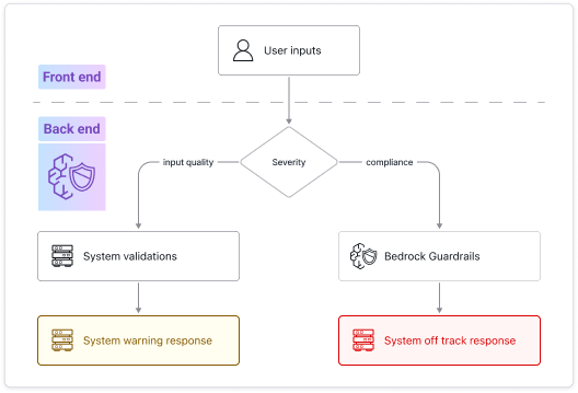
Requirement: enforce Responsible AI Governance. Implement customized safeguards to strictly adhere to enterprise policies, ensuring the model filters harmful content and adheres to brand guidelines without hallucinations.
- Design goal: architect a tiered control mechanism that differentiates between active coaching (e.g., guiding users to upload clearer photos) and policy enforcement (e.g., blocking competitor mentions).
- My design reasoning: We needed to show leadership that the AI is nuanced. It must distinguish between a helpful correction (user error) and a hard refusal (policy violation).
- Solution: I designed two distinct levels of guardrails:
- Level 1 (soft): when the customer uploads a half-cropped license, the AI politely asks for a full photo (helping).
- Level 2 (hard): when the customer asks "Can you check quotes from other companies?", the system triggers a hard stop (protecting).
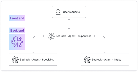
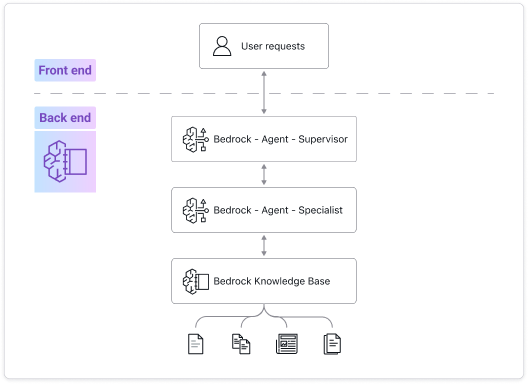
Requirement: Sales needed to demonstrate multi-agent orchestration. They required a way to visualize how the system handles complexity through collaboration.
- Design goal: to clearly illustrate the workflow logic and efficiency to Gartner's leadership. We needed to show that the system operates like a structured workforce, not a black box.
- My design reasoning: To make this abstract concept understandable, I structured the "orchestration" into three specific roles based on real-world business logic:
- Intake agent: for front-line data collection.
- Claims specialist: for execution and decision-making.
- Supervisor: for final validation.
- Solution: I scripted a specific "handoff" sequence to visualize this workflow. The intake agent explicitly states, "Transferring you to a specialist." Synchronized with the backend diagram, this visually proved the efficiency of the multi-agent system.
Requirement: demonstrate that the AI is retrieving data from actual internal documents (e.g., policy PDFs), not just generating text.
- Design goal: ensure accuracy and confidence. In financial contexts, customers need to know the numbers come from a binding contract, not the AI's "imagination."
- My design reasoning: We needed a moment where the AI proves it "read" the specific rules for this customer.
- Solution: I designed a "policy check" interaction. When the customer asks about coverage limits, the AI doesn't answer instantly. It pauses to say "Checking your policy details..." (simulating the retrieval latency) before delivering a precise, cited answer.
Requirement: demonstrate the model's ability to extract structured data from unstructured formats (like images or PDFs) to eliminate manual entry.
- Design goal: streamline the intake. The user shouldn't have to type information that is already available on their physical documents.
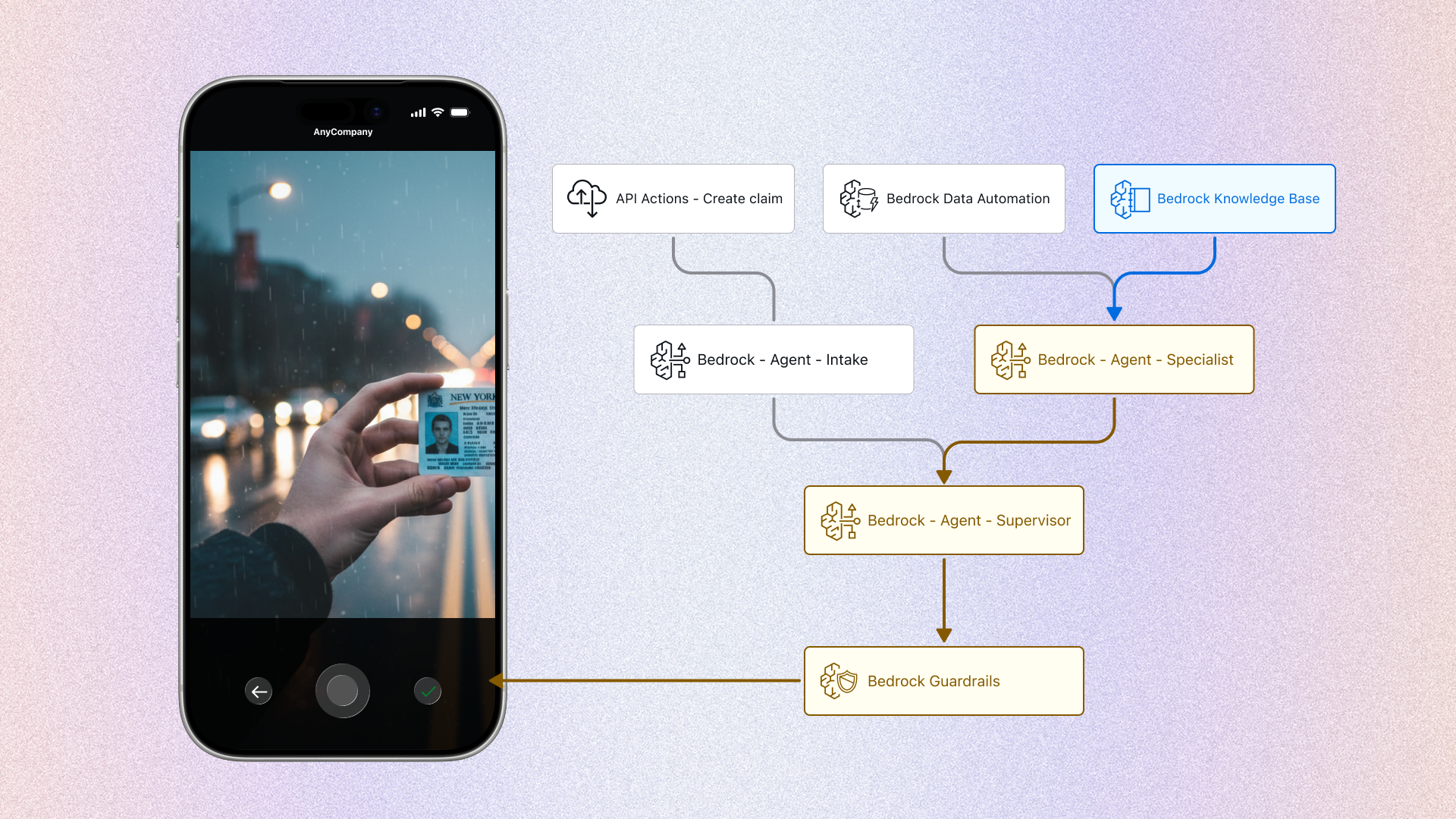
- Solution: I applied this capability to the "driver's license scan" step. The intake agent automatically extracts the name, address, and license number to pre-fill the claim form, proving the system's efficiency.
.png)
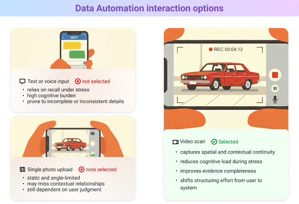
While the "driver's license" feature satisfied the initial data automation requirement, I realized we were only scratching the surface of the technology. I discovered that BDA could process not just static documents, but also dynamic video footage.
The design reasoning (the missing link): Armed with this insight, I revisited the claim workflow. I asked myself a critical question: How do we best communicate the complex reality of the crash scene to the system? Asking the user to describe it creates friction; asking for photos might miss the angle. I realized that video was the only medium that could capture the "ground truth" effectively. But this wasn't just about data; it was about the user.
- The customer insight: after a car accident, a customer is likely in a state of panic or shock. Asking them to type out a description or take perfect photos is mentally taxing.
- The leap (my proposal): I proposed expanding the BDA use case from just "documents" to "scene assessment." I pitched a video upload workflow.
- The result: instead of typing, the customer simply says "I'm at the scene" and scans the car. The AI analyzes the raw video and instantly lists specific damages (e.g., "cracked bumper").
- Why this matters: This turned a standard "file processing" feature into a compassionate, user-centric solution that handles the heavy lifting when the customer is most vulnerable.
After defining the individual technical features, my next step was to arrange them into a cohesive narrative. A demo is not just a list of capabilities; it needs to feel like a natural conversation.
I mapped out a specific "no bodily injury" claim scenario and structured the workflow to introduce each technical capability at the most logical moment in the user's timeline:
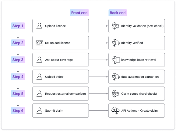
The Narrative Structure:
- Step 1: Verification (Establishing Trust)
- Action: The user uploads the driver's license (from Section 2.1). The system performs a soft validation check.
- Story Logic: We start here because identity verification is the expected operational first step in a real insurance workflow. This grounds the demo in procedural credibility before introducing more advanced AI capabilities. It also directly satisfies the Business Requirement to prove Data Automation and Guardrails in a realistic context.
- Step 2: Confirmation (Soft Check → Verified State)
- Action: If the license image is incomplete, the user re-uploads. The system confirms identity is verified.
- Story Logic: This step demonstrates the "Soft Guardrail" defined in Section 2.1. Instead of failing silently or producing a hard rejection, the system maintains a professional tone while guiding correction. This reinforces brand trust and proves nuanced guardrail behavior — not just binary enforcement.
- Step 3: Policy Inquiry (Knowledge Retrieval)
- Action: The user asks about coverage limits. The system retrieves relevant policy data from the knowledge base.
- Story Logic: This is where we explicitly satisfy the Retrieval requirement. The AI pauses to "check policy details," visually signaling that it is referencing structured internal documentation rather than generating generic text. This moment directly addresses the Sales mandate to prove enterprise-grade accuracy.
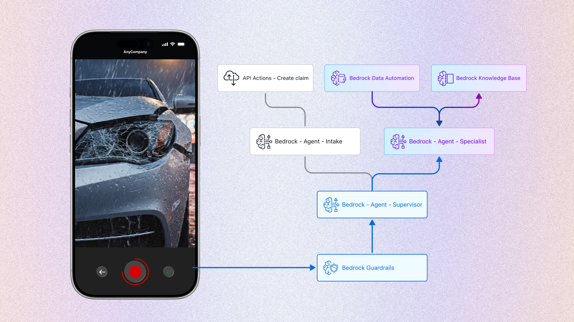
- Step 4: Assessment (The Experiential Peak)
- Action: The user uploads a scene video. The system performs data automation extraction on the footage.
- Story Logic: Once identity and policy context are established, we move to the core problem. Placing the video upload here creates the peak of the demo. It demonstrates BDA's expanded capability (from static documents to dynamic video) and reinforces the user-centric insight from Section 2.2: reducing cognitive load during high-stress scenarios.
- Step 5: The Pivot (The Stress Test)
- Action: The user asks: "Can you help me check if other companies offer better coverage?"
- Story Logic: After successfully analyzing the damage, it is natural for a user to question pricing. I deliberately placed the Hard Guardrail trigger here to prove that governance remains active even when the interaction is progressing smoothly. This satisfies the requirement to demonstrate compliance enforcement without breaking the conversational flow.
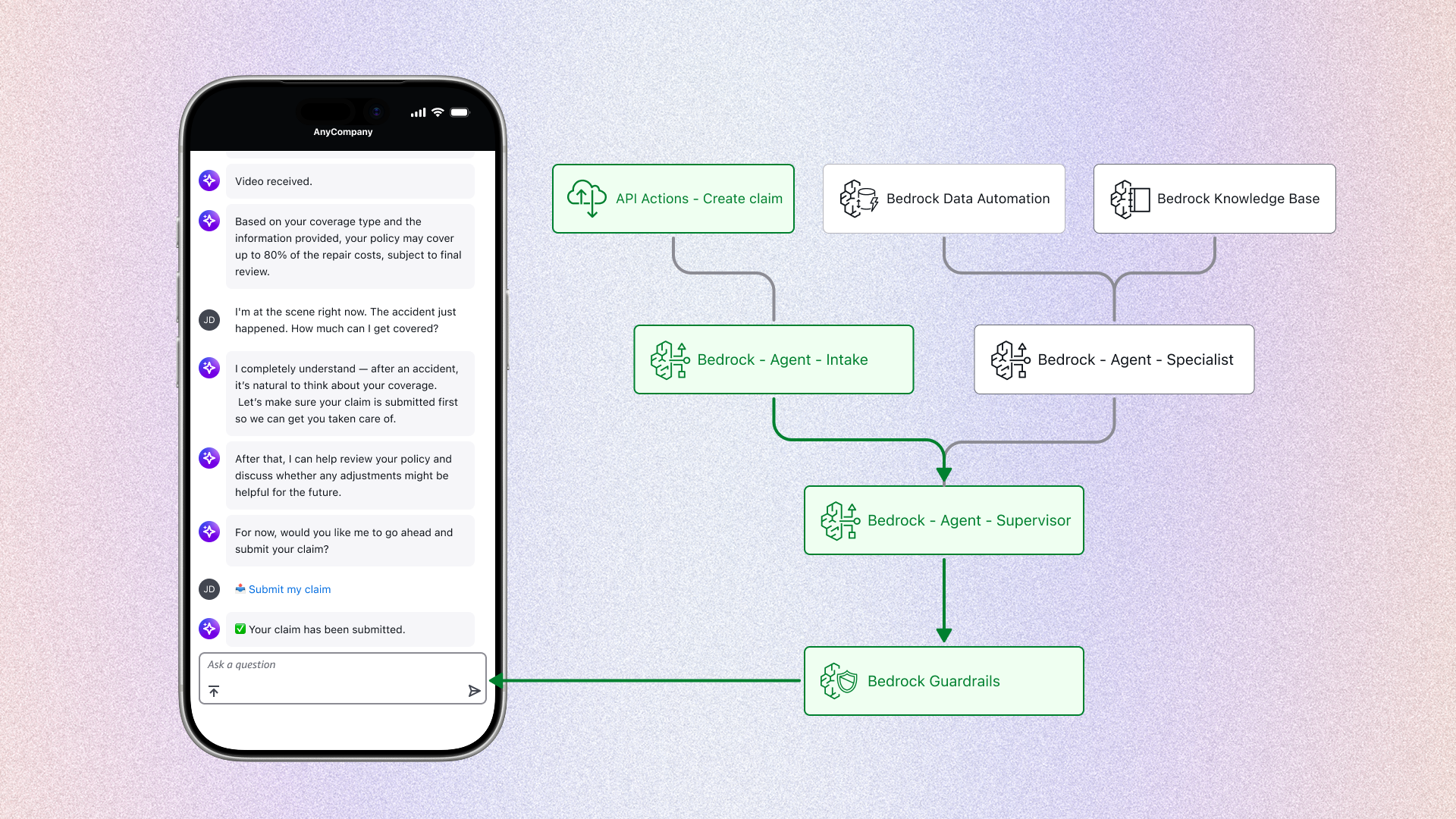
- Step 6: Closing the Loop (Submission)
- Action: The AI politely declines the competitor request and asks whether to proceed. The user confirms, and the system executes the API action to create the claim.
- Story Logic: It is critical to end with a completed transaction. This confirms to stakeholders that the system is not merely conversational — it is operational. By visualizing the API action, we reinforce the "Enterprise-Ready" mandate defined in Section 1.
Design intent: by organizing the requirements into this specific sequence, I transformed disjointed technical proofs into a linear story. The "no bodily injury" scope ensured that this narrative remained focused on the visual interaction without getting sidetracked by medical complexities.
The problem: The "black box" risk. The biggest challenge was the gap between the visible UI and the invisible technology. If we showed only the front-end app, the sales team would have to verbally explain the complex AI logic, risking that Gartner's leadership might tune out or suspect the demo was fake.
Level 1 decision: choosing the format
I first evaluated how to present the front-end (user) and back-end (system) together.
- Alternative A (sequential): demo the app first, then switch to slides.
- Design reasoning: Rejected. This creates a "memory gap"—executives forget the interaction by the time they see the diagram.
- Alternative B (developer view): show code logs next to the UI.
- Design reasoning: Rejected. This is too technical. C-levels need to see business logic, not JSON.
- The decision: a synchronized split-screen. Left side for the customer (front-end), right side for the brain (back-end).
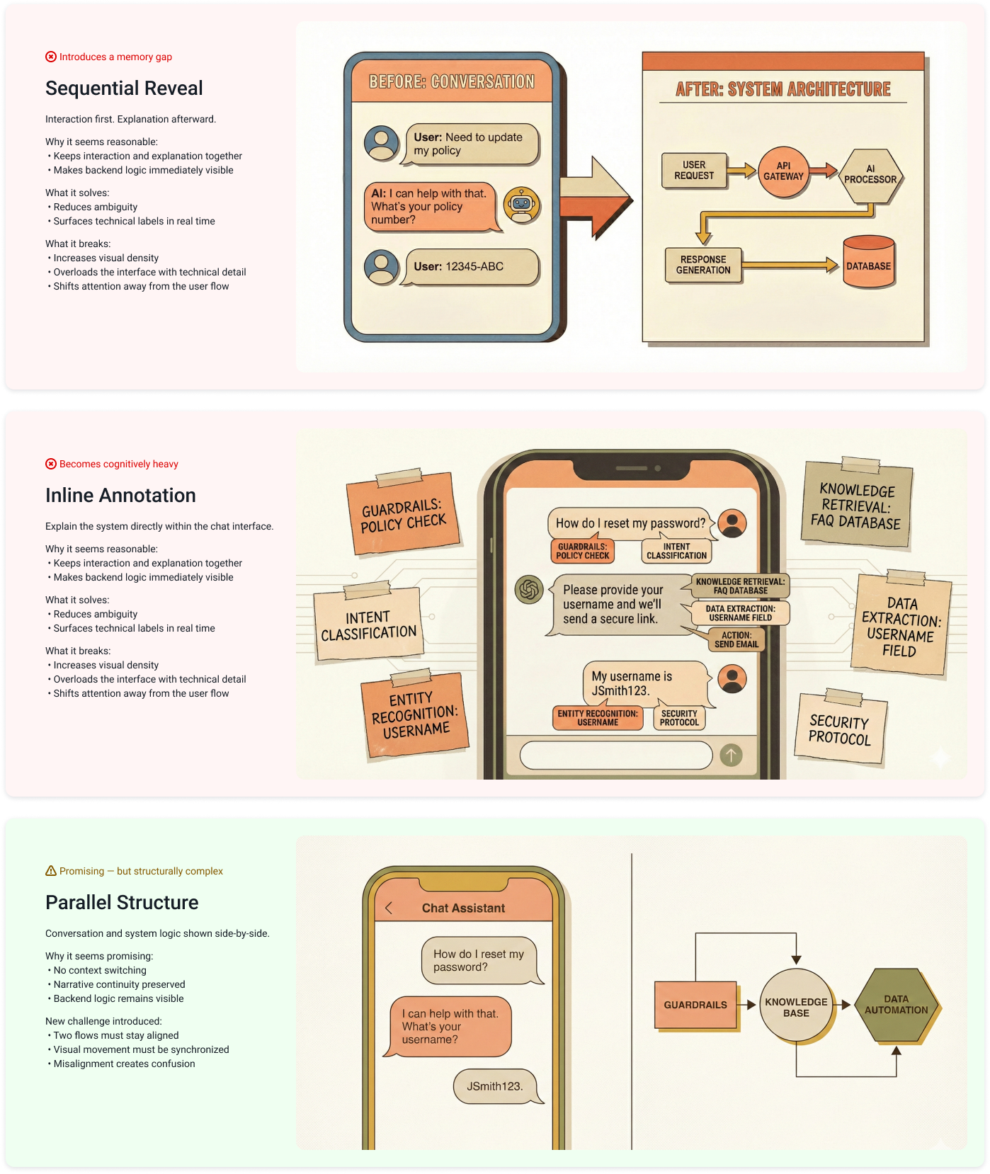
Level 2 decision: aligning the motion (the visual flow)
Once the split-screen was decided, I faced a conflict in visual patterns. I evaluated three distinct interaction models using my design reasoning to find the lowest cognitive load:
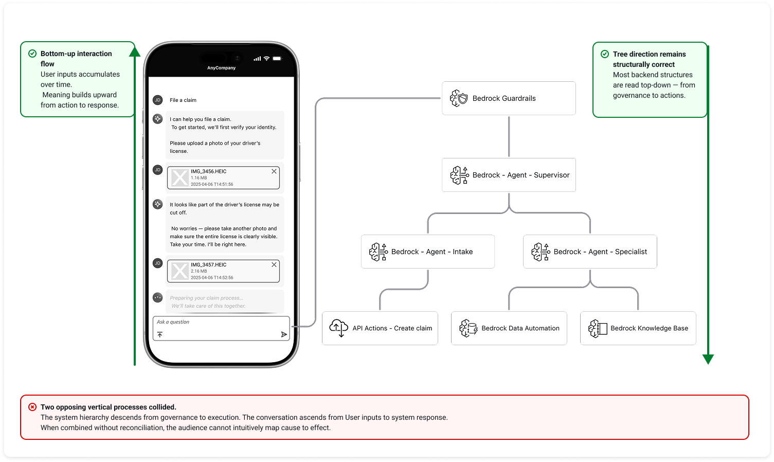
- Option A: The "standard" clash (bottom-up vs. top-down)
- Concept: keep the standard chat UI (newest message at bottom) and the standard architecture diagram (input at top, output at bottom).
- Design reasoning: I realized this layout creates "visual tension." The user's active focus is at the bottom-left, while the system's start point is at the top-right. This forces the audience's eyes to constantly zig-zag diagonally across the screen.
- Decision: rejected. The high physical effort makes it hard to track the correlation between cause (user) and effect (AI).
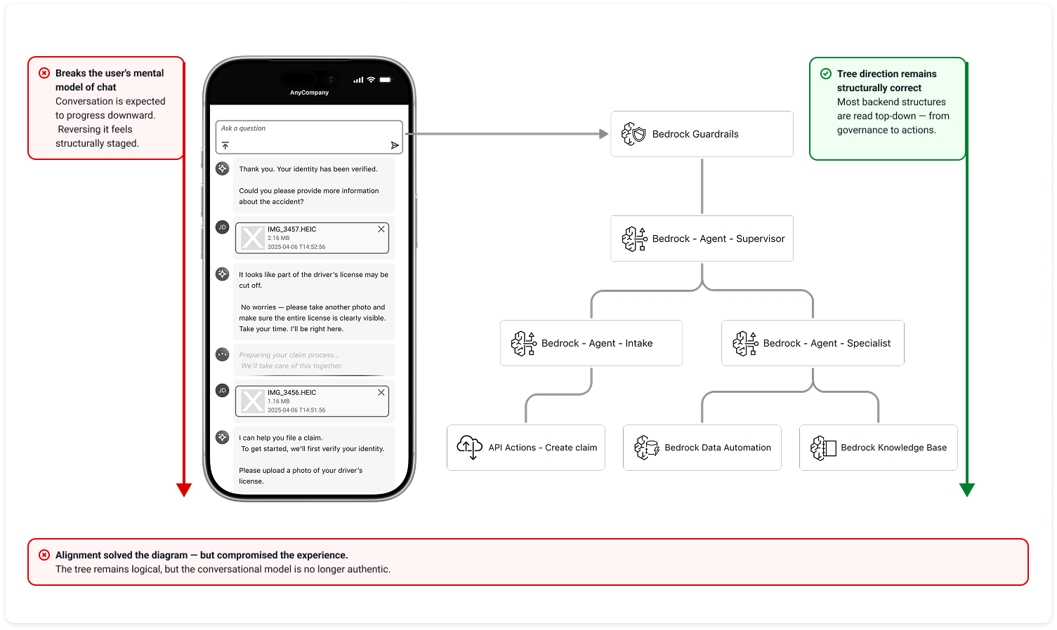
- Option B: The "unnatural" UI (top-down chat)
- Concept: invert the chat interface so new messages appear at the top, matching the standard top-down diagram flow.
- Design reasoning: While this aligns the motion, it violates the user's mental model. Real chat apps (iMessage, WhatsApp) never flow this way. It makes the prototype feel like a fake presentation tool rather than a real product.
- Decision: rejected. To build trust, the front-end experience must be authentic.
- Option C: The "inverted" architecture (bottom-up synchronization)
- Concept: keep the chat natural (bottom-up) and deliberately invert the architecture diagram to also trigger from the bottom up.
- Design reasoning: By aligning the "newest event" on both screens to the same vertical position, we create a shared "active horizon." When a user sends a message (bottom-left), the intake agent lights up immediately next to it (bottom-right). This physical proximity allows the audience to track cause and effect in a single horizontal glance.
- Decision: selected. This approach minimizes eye travel and cognitive load, making the connection intuitive.
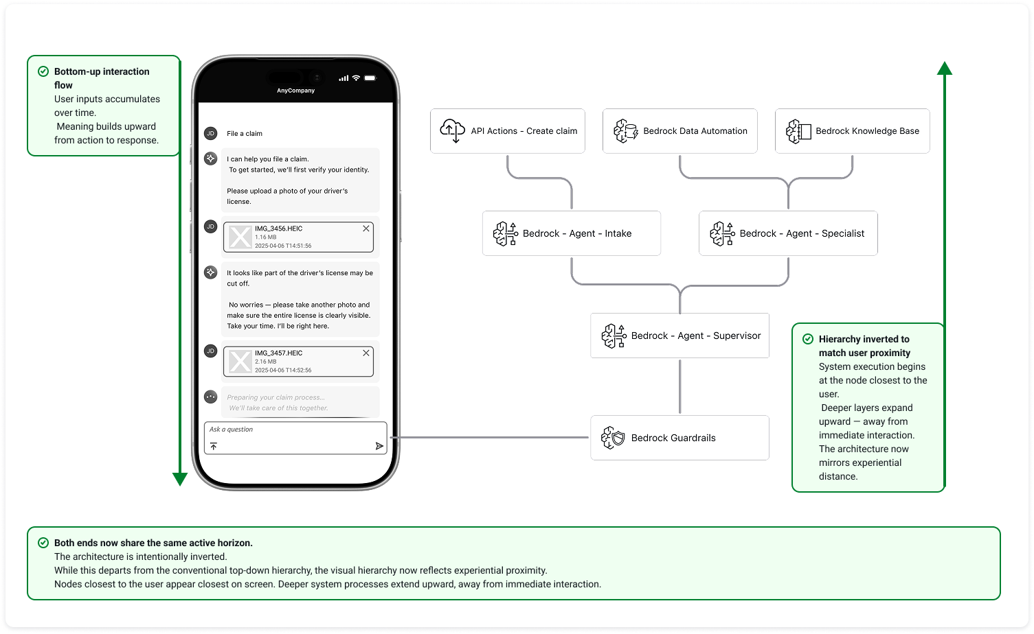
The result: Visual synchronicity. By choosing Option C, I ensured that the "current moment" for both the user and the AI happened on the same horizontal plane. This "visual synchronicity" allowed executives to intuitively grasp the complex orchestration without needing a technical explanation.
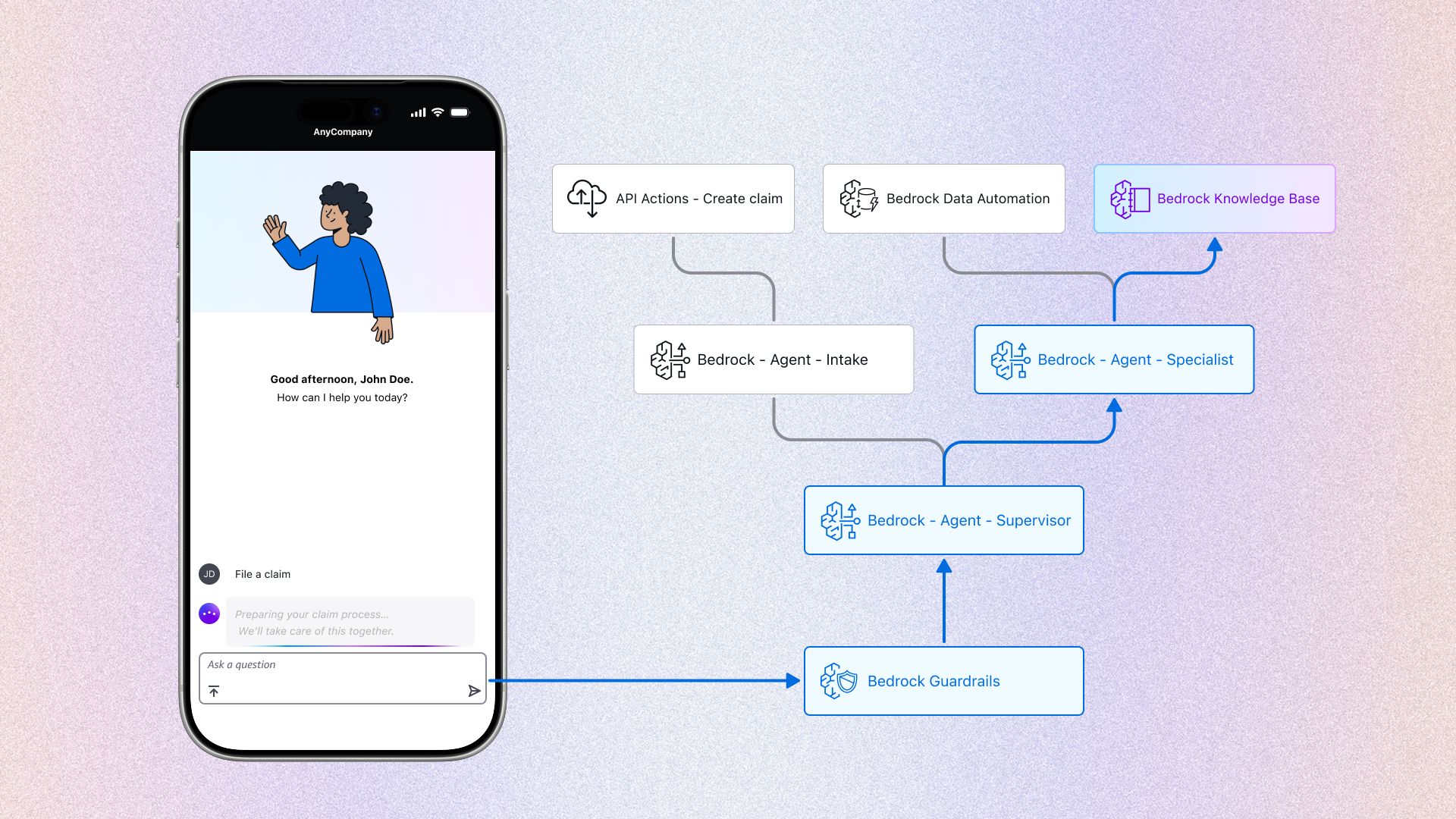
Visualizing the "orchestration". With the layout fixed, I used the right side to reveal the hidden logic defined in section 2.1:
- Agent handoff: When the front-end says "Transferring to specialist," the back-end diagram visualizes the shift from the "intake node" to the "specialist node."
- Guardrail trigger: When the front-end declines a request, the back-end highlights the "guardrail intercept" path.
The problem: The "unfinished story" risk. If the demo ended at the user submitting the claim, it would create a psychological "open loop." Gartner's leadership might be impressed by the app, but they would immediately ask operational questions: "Who reviews this? Can we trust the AI's judgment? How do we verify the user's background?"
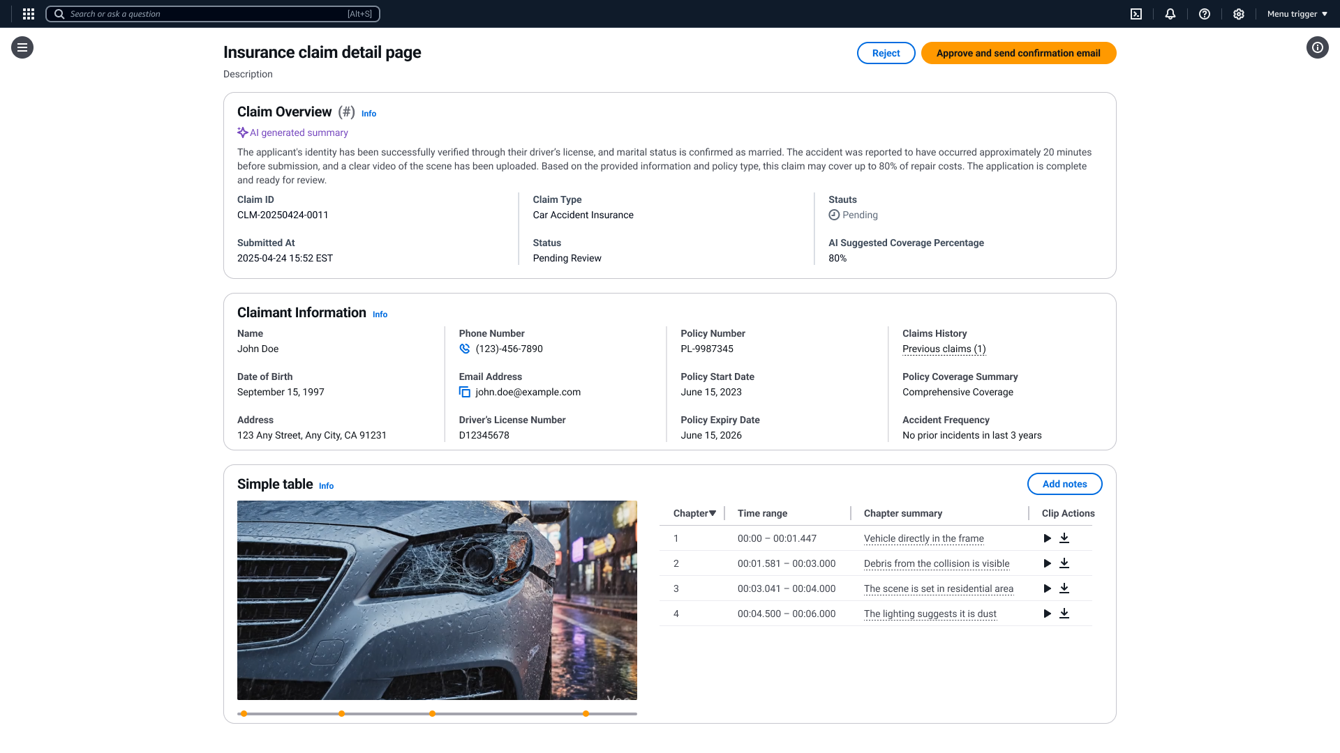
Solution: The specialist dashboard. To address this, I extended the design to include the specialist persona. I designed a desktop interface specifically for decision support, demonstrating how AI augments human efficiency in three key areas:
Feature 1: contextual intelligence (summary & history)
- The feature: Instead of a blank screen, the dashboard pre-populates with a system-generated case summary and the user's previous claim history.
- Design reasoning: operational efficiency. A specialist shouldn't waste time hunting for basic info. By automatically aggregating "what happened now" (summary) with "who is this user" (history), we allow the human to grasp the full context in seconds, not minutes.
Feature 2: AI-augmented review (video to data)
- The feature: The dashboard displays the "AI video analysis" panel. The AI breaks the raw footage down into structured "chapter summaries" (e.g., 00:00-00:01: The video depicts damage to the front bumper...).
- The trust signal: Crucially, I included a confidence score (e.g., "98% confidence") next to each detected item.
- Design reasoning: trust calibration. At this stage of AI adoption, human reviewers needed a metric to gauge the model's certainty. The score acted as a "guide rail"—high scores allowed for quick approval, while low scores flagged items for deeper manual review.
Feature 3: one-click automation (the "draft & review" pattern)
- The feature: Once the specialist clicks "approve," the system immediately opens a modal with a pre-drafted confirmation email.
- Design reasoning: human-in-the-loop control. The AI generates the draft (saving time), but the human confirms it (ensuring safety).
Design note: Vision over specification
- The scope: As this was a vision prototype (demo), my goal was to showcase the art of the possible.
- The intent: I prioritized illustrating a wide range of potential efficiency boosters—like auto-summarization, confidence scores, and historical retrieval—to inspire the client's imagination. Detailed edge cases and deep-dive implementation specs were intentionally reserved for the future productization phase.
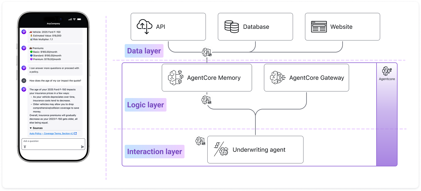
3. Iteration 2 – Bedrock AgentCore Release
In July 2025, AWS Leadership decided to reuse the insurance case study for the public launch of Bedrock Agent Core. However, the context shifted dramatically:
- The audience: From non-technical C-level executives to developers and architects.
- The goal: From demonstrating "business logic" to teaching "technical implementation."
- The scenario: To create a simpler, more relatable entry point for developers, we shifted the use case from a complex "accident claim" to a streamlined "new insurance quote" workflow.
When the demo transitioned from a private executive presentation to the public launch of AgentCore, the requirements evolved again. The audience shifted toward developers, and the system architecture became more sophisticated.
However, the real test was not adding new components — it was validating whether the design model could absorb structural change without collapsing.
Instead of redesigning the experience from scratch, I applied the same Glass Box framework and extended it.
The original multi-agent orchestration was simplified into a single underwriting agent. Rather than visualizing role-based collaboration, the focus shifted to system-level orchestration.
Because the layout had been built as a modular split-screen system, this change required reconfiguration — not reinvention.
New architectural elements such as:
- The AgentCore Gateway
- Identity Layer
- The Unified Runtime Container (Purple Boundary)
were introduced.
But they were not treated as isolated technical features.
They were mapped into the existing visual grammar:
- Nodes remained consistent in scale and interaction logic
- Backend states continued to mirror front-end transitions
- The purple container became a structural boundary indicator within the same layout system
The key was that the visual language did not change — only the components inside it evolved.
This phase validated something more important than a launch demo.
It proved that the Glass Box was not a one-off storytelling artifact.
It was a reusable structural model.
Whether the system involved:
- Multi-agent collaboration
- Tool-based MCP connectivity
- Runtime governance layers
the design could accommodate increasing complexity without breaking clarity.
That was the scalability.
Not the infrastructure —
the model.
The flexibility of the design allowed us to explain these complex new features (MCP, Memory, Runtime) with minimal friction.
- Collaboration: I handed off these interaction designs and wireframes to an external design agency.
- The polish: They applied the final AWS marketing visual compliance (brand polish/motion graphics) based on my structural blueprints.
- The launch: The final video was released on the official AWS YouTube channel, successfully introducing Bedrock AgentCore to the global developer community.
If the video above does not display successfully, please click the button below to watch it on YouTube.
Watch video on YouTube4. Scaling Success: Reusing Design Patterns
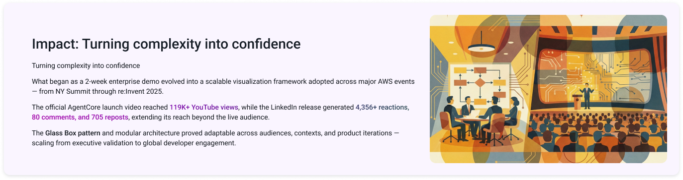
Following the high visibility of the Agent Core launch (Section 3), the "Glass Box" split-screen pattern became the internal gold standard for visualizing GenAI at Gartner.
- The demand: Solutions Architects (SAs) across the organization began reaching out, wanting to apply this specific visual storytelling framework to their own customer accounts.
- The constraint: As the sole designer supporting the entire department, I quickly became a bottleneck. It was impossible for me to manually design high-fidelity "Glass Box" prototypes for every single client engagement.
To solve this scalability challenge, I shifted my focus from creating individual artifacts to creating a system.
- The Collaboration: I partnered with the technical team to translate my Figma components and interaction logic into code.
- The implementation: The SAs adopted the visual patterns—the split-screen layout, the bottom-up animation, and the node-based architecture—and rebuilt them as a reusable React Flow library.
- The "self-service" model: By codifying the design rules into the React Flow component, we essentially "embedded" a virtual designer into the code. SAs could now drag-and-drop their own agent architectures and generate professional, "Glass Box" style demos without needing my direct involvement on every pixel.
While I cannot share specific visuals due to strict Non-Disclosure Agreements (NDAs), the framework proved highly adaptable. SAs successfully deployed this "Glass Box" pattern across a wide range of industries, including but not limited to:
- Entertainment: orchestrating complex event logistics and venue management workflows.
- Heavy manufacturing: monitoring construction equipment health (e.g., forklift maintenance) and visualizing predictive repair cycles.
- Life sciences & pharma: accelerating drug discovery through R&D lab assistants and automated research paper analysis.
The conclusion: This transition marked the maturation of the project. The design didn't just serve one client (Gartner) or one launch (AgentCore); it became a repeatable "AI Story" framework that empowered the entire organization to visualize complex intelligence, regardless of the domain.
5. Conclusion – Beyond the Interface
What started as a frantic 2-week sprint to build a single customer demo evolved into a foundational design framework for the entire organization.
- For the business: We transformed a "Black Box" technology into a "Glass Box" solution. By visualizing the invisible logic of AI, we helped Gartner's leadership—and subsequently, clients across industries—move from skepticism to trust.
- For the team: The "split-screen" pattern and the React Flow library solved a critical scalability bottleneck. It empowered non-designers (solutions architects) to tell compelling, consistent AI stories without needing a designer in every room.
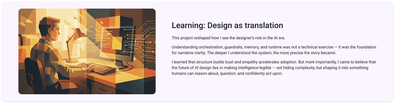
This project was a defining moment in my career. It taught me that in the age of Generative AI, a designer's role is no longer just about pixels or flows; it is about Translation.
- Demystifying Fear: AI can be intimidating. My biggest takeaway is that understanding is the antidote to fear. As I dove deeper into the technical constraints (BDA, Guardrails, MCP), I realized that the more we understand the "Material," the better we can shape it.
- Continuous learning: The rapid evolution from "Bedrock Agents" to "AgentCore" (section 3) proved that adaptability is the new stability. Staying curious and learning alongside the engineers was the only way to deliver a design that felt "real."
In the short term, designers translate complex AI systems into experiences people can understand. This project proved that clarity builds trust.
As AI agents increasingly take over operational tasks — generating outputs, processing workflows, and executing decisions — translation alone is no longer sufficient.
AI can automate execution.
But it cannot determine whether the solution being executed is the right one.
That responsibility remains human.
The real opportunity for UX in the AI era lies in validation — ensuring that what we design genuinely solves meaningful problems, improves efficiency, and creates measurable value for users and the business.
AI may scale action.
Design must ensure that action is worth scaling.