1. BACKGROUND
Over the past 20 years, Chick-fil-A has good made use of its internal office website (CFAHome), with various departments adding content, new electronic reports as well as operation software tools. Although they updated the user interface design for menu navigation several times, they didn't have an information architecture. Over time, it became difficult for employees to find content and software tools, especially operators who didn't work at the headquarters' office but were in charge of the chain's restaurants.
2.Project Goal
The main objective was to design information architecture and improve the experience of navigating the CFA website for the target user group: operators. This architecture would guide the next version of the web navigation design.
The secondary objective was to collaborate with the metadata management team to connect the taxonomy system to the information architecture system on individual detail pages. With metadata, our team built a shortcut for users to jump from page to page.
3. PLAN & EXECUTION
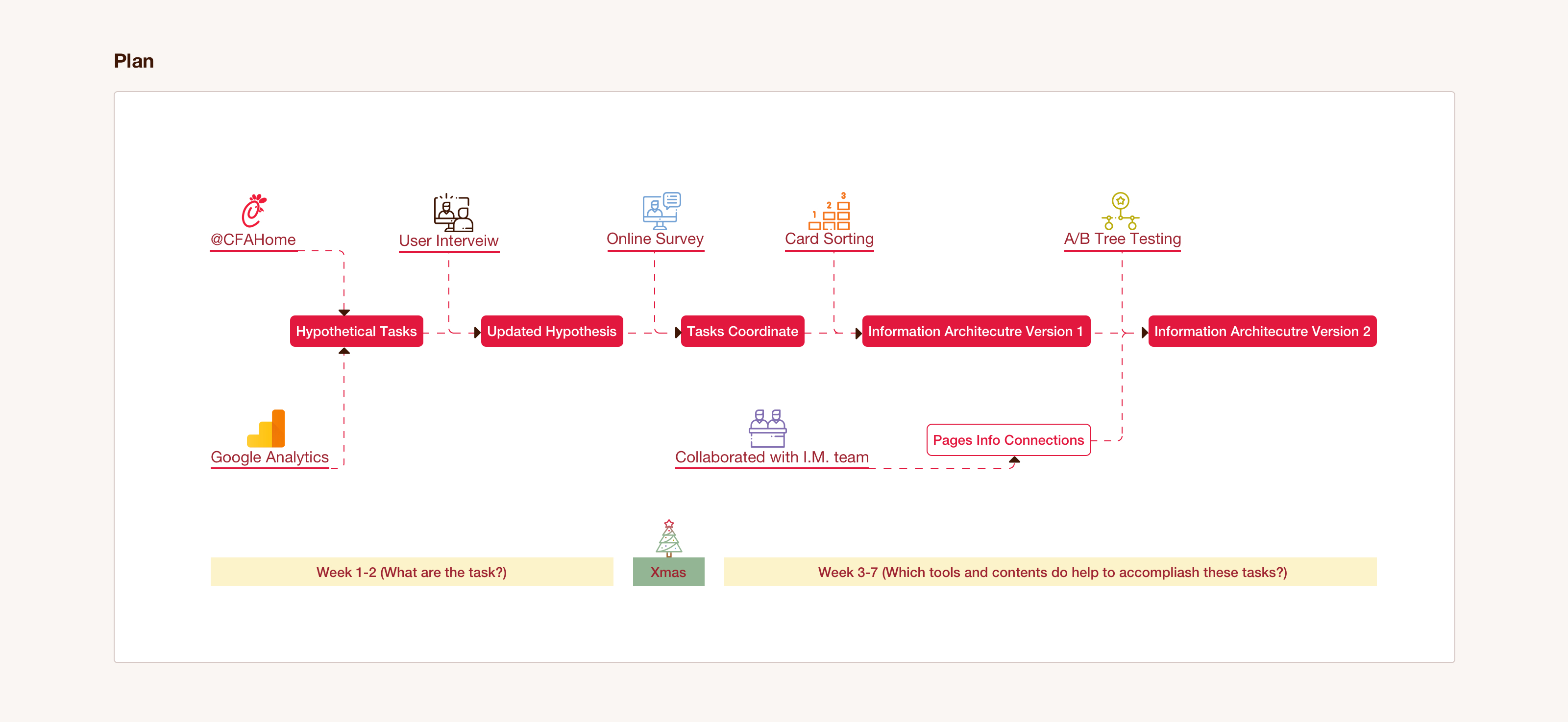
The project's duration was eight weeks, but with the then-holiday season approaching, I had to remain objective during the planning and execution phases. So, I did the following:
1. First, I studied the initial design of the CFA website. I then received a Google Analytics report which helped me make hypothetical tasks based on frequency.
2. I interviewed four operators to update my hypothesis based on priority right before the Christmas holiday. I also released an online survey about goals and challenges. The feedback was instrumental in building the task coordinate system.
3. After the holiday season, I facilitated a card-sorting exercise based on tasks and the information a user needed to complete them. I then drafted the first version of the information architecture.
4. I collaborated with the metadata management team to link the information with branches in a cyber diagram format.
5. I visited my client's headquarters and hosted A/B tree testing to update and accomplish the final version of the design.
3.1 hypothetical tasks based on the usage frequency
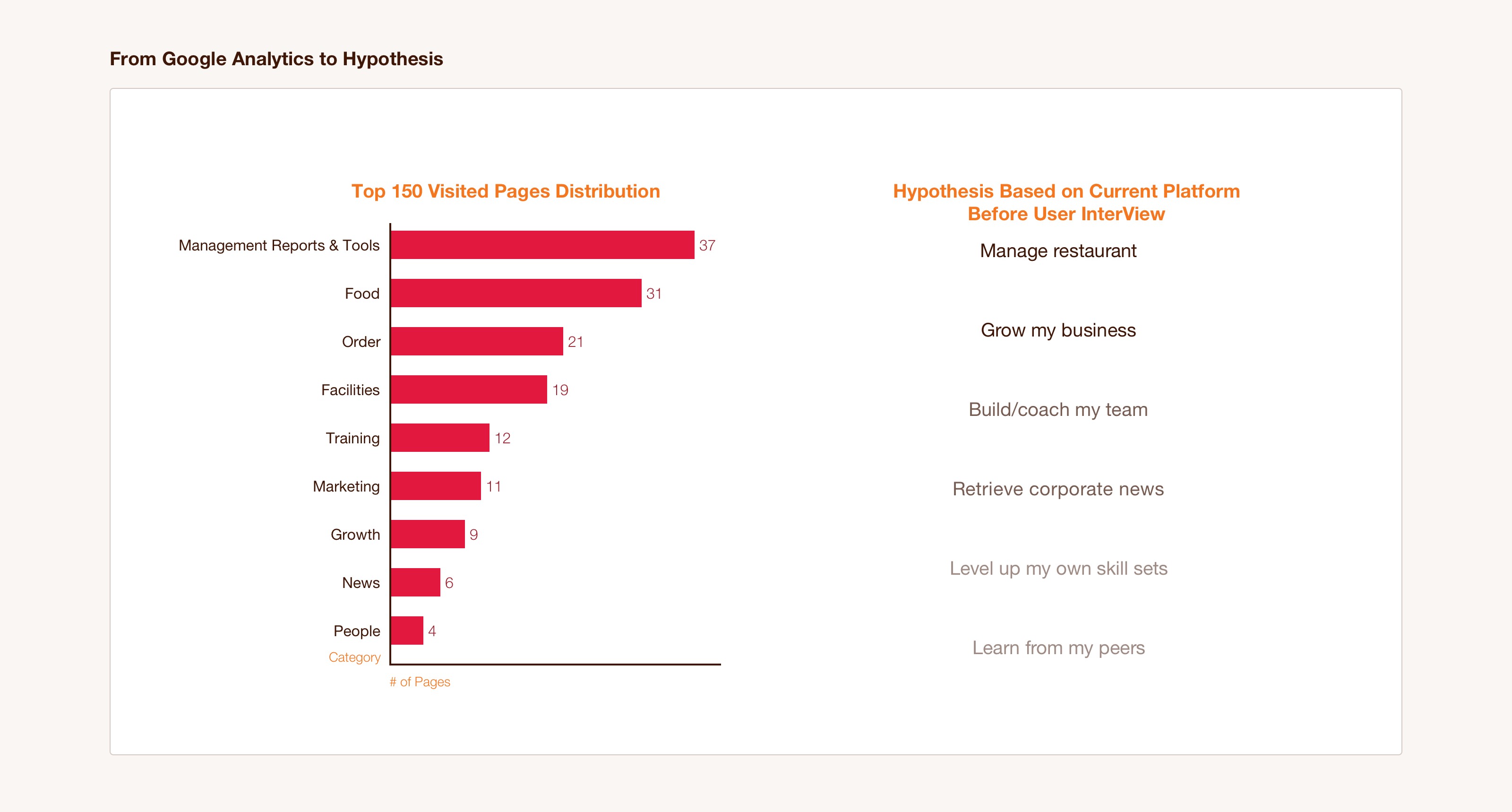
At the beginning of this project, the CFAHome site was the only resource I had. I studied the contents and tools to get the general idea of what my target users worked with every day.
Days later, I received a Google Analytics report. It revealed the top 150 pages visited by operators in 2018. I grouped these pages into the current platform's first-tier menu so I could understand the daily tasks of an operator.
By the end of the first week of execution, I had summarized the hypothetical task list. This list was my starting point in designing the information architecture.
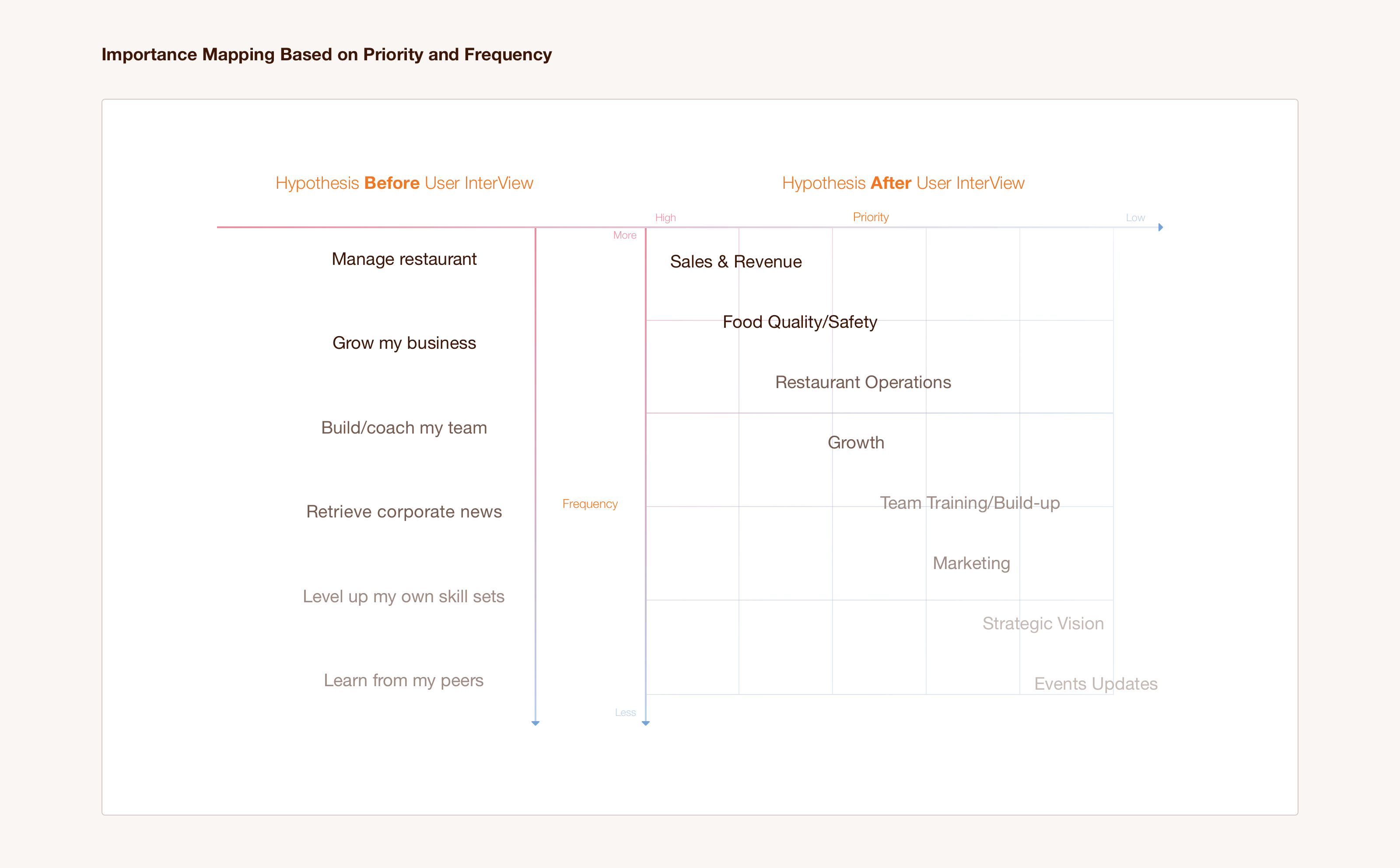
3.2 task coordinate system
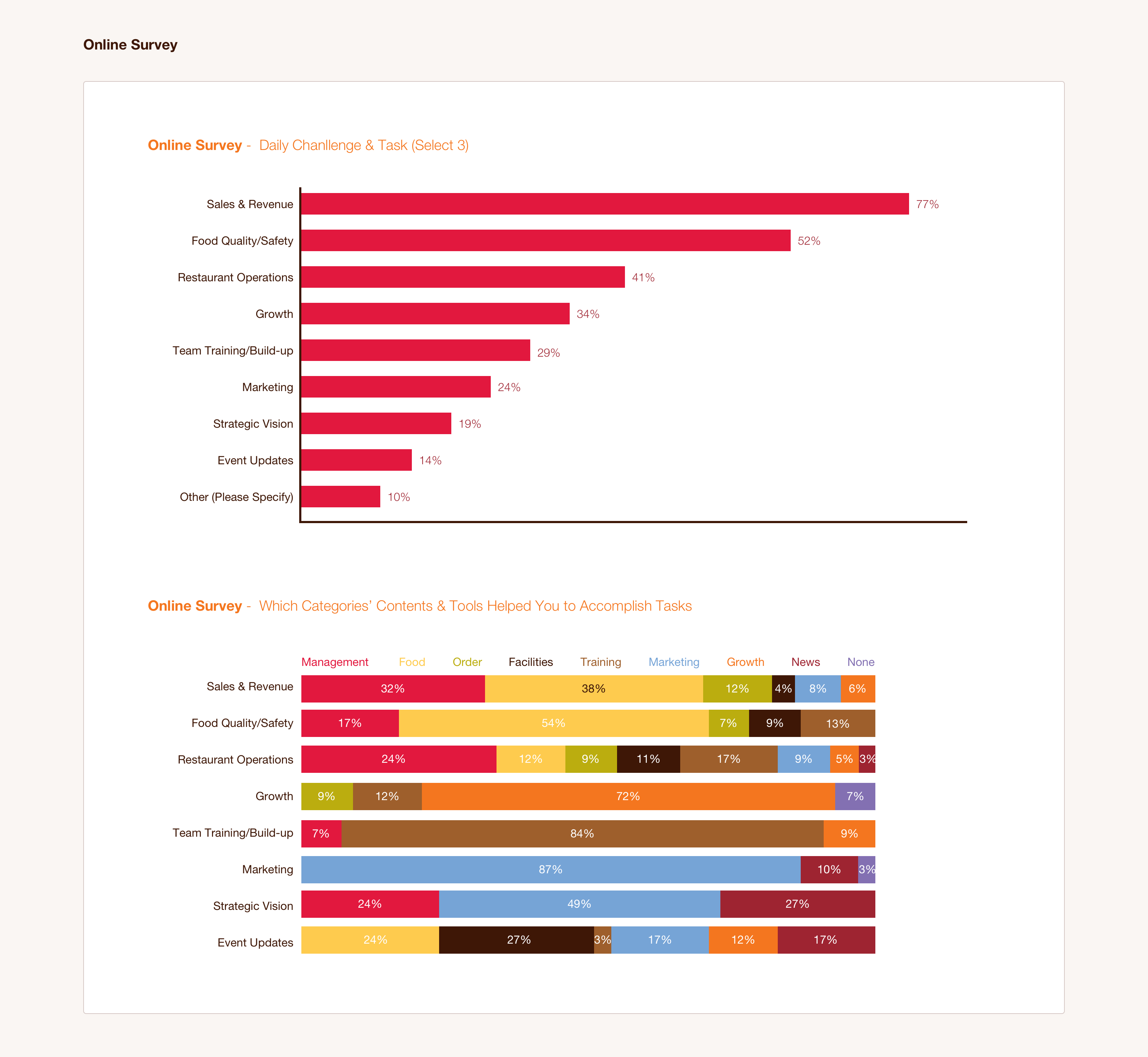
I interviewed four operators about their daily routine and the frustrations they faced with it. To supplement this, I released an online survey that inquired about the main tasks and challenges that the operators faced.
Afterward, I collected the quantity data of all 225 operators' feedback that I had gotten from both the survey and the interviews. All the sources for a coordinate task system were now ready to be designed. Priority was set on the x-axis, while the frequency was set on the y-axis. I allocated contents, reports, and tools into this coordinate system, which laid the groundwork for the information architecture.
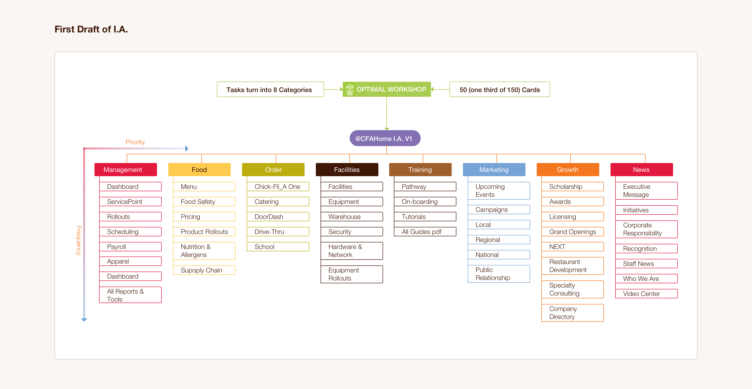
3.3 First draft
After Christmas, I picked fifty topics, including their goals and the tool or contents they needed to achieve these goals. Based on the results of the card-sorting exercise, I learned the proximity of these contents and tools, and I drafted the first version of the information architecture based on my coordinate system.
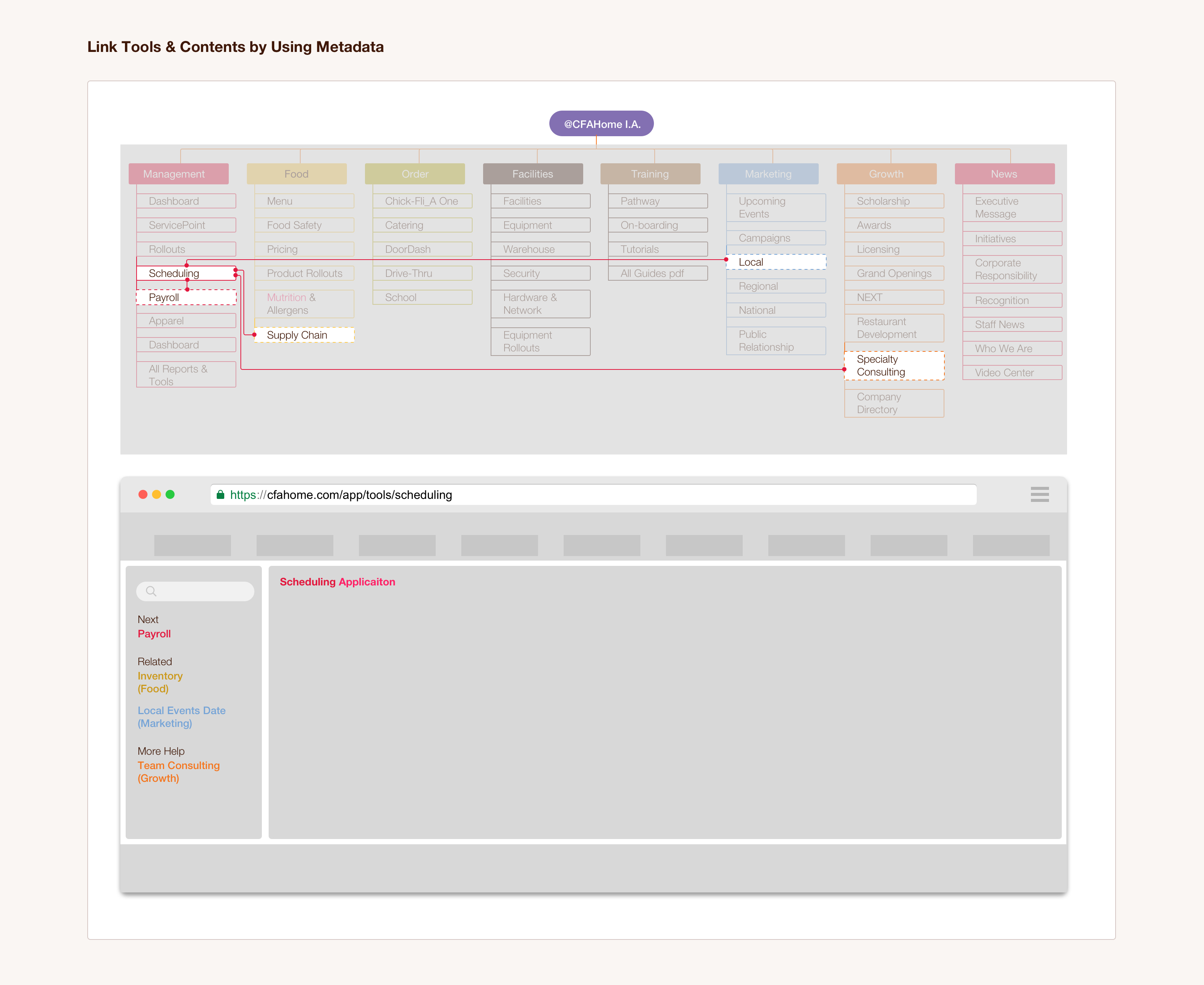
3.4 Link contents & Tools by using metadata
Traditional information architecture is designed in a tree diagram format. To find content, the user needs to explore all tiers and then navigate each branch. However, if at any point the user tried to deviate from their path or sail through with other materials, he or she would need to return all the way back to the root node (or the tier in which they selected their topic and subtopics), even when they selected relevant content, thus making the website more frustrating to navigate and inefficient as a whole.
Metadata solved this problem by creating a shortcut to link relevant content. We learned from our feedback that operators tended to execute related tasks all at once, so to help them switch from contents to tools more conveniently, we transformed the initial tree form design into a cyber form design.
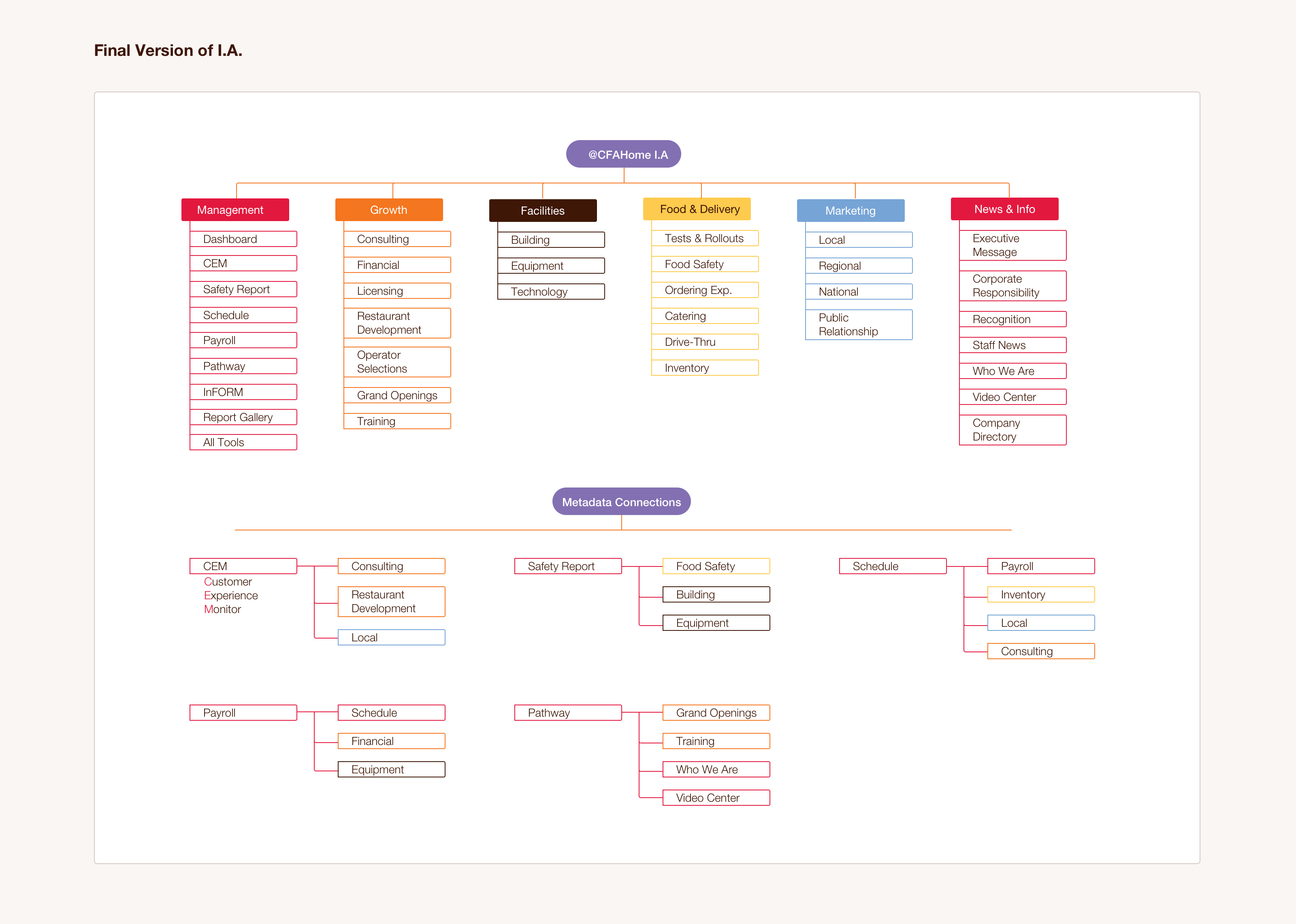
3.5 Final version
In the eighth and final week of this project, I visited my clients at their headquarters’ main office and facilitated tree testing with twenty-five operators. For more conclusive data, I added an interview session after every five testers finished.
For the final ten testers, I hosted an A/B testing session for the findability of topics. “A” group used the initial structure of navigation, while “B” group used the new design. I picked twenty tasks for each group to navigate; the pass rate was 97% for “A” Group and 94% for “B” Group. "B" group's passing rate is a bit lower than "A" group partly because they first had get accustomed to the new design. However, navigating through the new design clocked in at an average time of 33 seconds, while the former was at 69 seconds. Finally, sailing through related tasks this time took less than 10 seconds by using cyber form design. Overall, our clients were satisfied with these results.
4 Next Step
The next step was to redesign web navigation by using information architecture. Linking the content under the management category was a sample; CFA would hire a data expert to add metadata tags to other divisions of the content.
5 Takeaway
Card sorting and tree testing are two useful tools to design information architecture. They play different roles in the process. Card sorting sharpens the ideas to tangible solutions; on the other hand, tree testing validates these outputs.
Metadata empowered the traditional information architecture design by linking individual contents and applications together. Limited by its initial tree form, CFA’s home site had seen an expanded information line and faster navigation when it was redesigned into cyber form. Enterprises across many industries have caught on and implemented this new structure for the same benefits.